How to get the Bar Graph to work properly?

Hello,
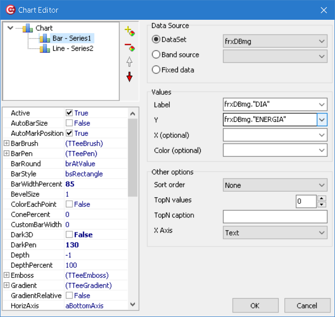
I am trying to make a report which has a Bar Graph of a column from a DataSet:
"DIA" "ENERGIA" "MINIMO" "MAXIMO"
1 38,1 0 1
2 67,7 0 1
3 68,22 0 1
4 88,51 0 1
5 54,41 0 1
I have selected the "ENERGIA" column as YValues and the "DIA" column for labels:
The result is not what I was expecting:
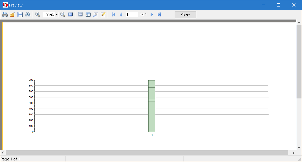
What am I doing wrong?
Thank you very much.
Jayme Jeffman
Comments
G'day Jayme,
What you appear to have generated is a "stacked bar chart" (albeit a monochrome one).
Were you expecting five separate bars?
Off the top-of-my-head, it appears you have not specified an X-axis...
I'll have another look when I have acxess to FastReport / TeeChart.
Cheers, Paul