Custom the Legend

Hello Everyone,
I'm looking to create a custom legend using a value that is on the same row for each bar in the chart and also wanting to eliminate the color key.
Data Fields
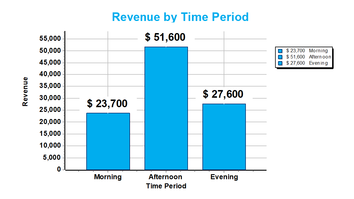
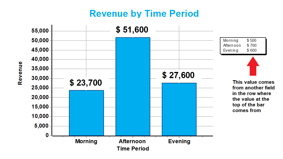
PeriodName (x axis label), Revenue (y axis label and bar topper), AverageAmount (want to use for legend)
Current legend
Proposed Legend
All help is appreciated.
Best regards,
John
Comments
G'day John,
I am making a lot of assumptions here because you don't say anything about versions of software or technique(s) for producing the Chart(s), so...
Assuming you have a "modern" version of FastReport / RAD Studio installed, and the Chart(s) are built with the bundled version of TeeChart, you should be able to access the "Legend" Property for the Chart Object (either in the IDE or from Code) and set its "Visible" Variable to "False". Not knowing how you have created the Report / Chart makes it hard to say precisely how to do this, but (for example) you may be able to double-click on the Chart Object and then use TeeChart's Dialog Box to clear the "Visible" Checkbox.
However re-reading your question just now I realised you don't want to turn the Legend "off", just render it without the "colour code" and with different currency amounts.
Have you tried "playing with" the "Legend Style" Combo-box? It is also available via the "Legend" Property. This might get you closer to your goal...
If not, I doubt that you can do the "customisation" with FastReport / RAD Studio and may require you to have a TeeChart "Pro" licence (with access to the source code).
Cheers, Paul
Thanks Paul,
I'm using XE7 with FR 2022.2.11
I came close with the legend properties, but in the end couldn't display the value I wanted.
I've had a couple of ideas...
What do you think? I'm partial to the Table Object idea but I'm certainly open to anything which helps me accomplish the goal.
All my best, John
Hey everyone!
I didn't do it the way I wanted, but I figured out a work around. I hope this helps someone else.
And now you have it! Essentially you're hiding the legend for the 1st series and the bars for the 2nd series to create a composite chart.
Series 1
Series 2
Result
Best to you all!
John
G'day John,
That is a very neat solutiion! I hadn't got my head around this, but was going for something more complex Glad you "beat me to it"!
Chheers, Paul